Responsive Web Design with Twitter Bootstrap
Bootstrap
Twitter’s Bootstrap library is one of the most popular front-end frameworks, with an amazing adoption rate by various web sites, from small to large. Bootstrap provides:
- Responsive Features: Enables seamless transitions between desktop, tablet, and mobile view sizes, with intuitive look-and-feel switching and custom single-view overrides.
- Layout Support: Fixed and fluid grid systems for web design.
- Style Components: Really nice looking form helpers, fonts, tables, etc.
- UI Components: Dropdown menus, buttons, accordions, alerts, progress bars and more, with JavaScript support.
Essentially, Bootstrap makes it easy to design a responsive website (that looks good in desktop or mobile views) and add user interface components that keep with the overall user experience.
Moving Loose Bits to Bootstrap
Loose Bits (this blog) previously had a non-responsive design - the main heading bar was far too wide when viewed on a mobile phone (like my iPhone). I had been itching to make this site mobile-friendly, and finally decided to bite the bullet and integrate Bootstrap.
I downloaded the full bootstrap build from source, so that I could customize parts of the framework and only add in what I needed. As this blog is hosted as an open source project on GitHub, the source code and build system is available for checkout or download at my Loose Bits repository.
While I did customize some colors and variables for Bootstrap and spent some time inserting Bootstrap-compatible CSS classes in my HTML layout, I have to say the overall experience was quite easy, required minimal changes, and I am pleased with the final website.
The different layout effects for various viewports can be viewed simply by resizing a browser window on a desktop computer. In desktop view, I’ve retooled the main header and navigation bar to look like:
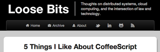
My layout uses the basic “inverse” (dark) Bootstrap theme and integrates the fantastic Font Awesome icons for each navigation bar menu item.
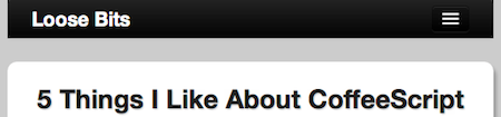
Loose Bits on Mobile!
Moving on to the mobile experience, the header and full navigation bars are replaced by a title-only heading with a clickable navigation menu button. Resizing a browser window down to mobile phone size (or if already on a mobile device), we get:
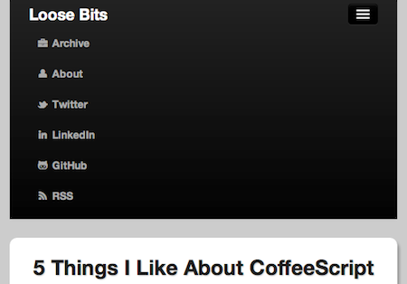
I’ve used the simple navigation collapse feature to have a clickable menu of all of the previous navigation bar items, so as to more effectively use the reduced real estate in a mobile view:
The rest of the website has a few other adjustments in mobile view mode, nearly all of which auto-magically happen without any further tweaks to Bootstrap configuration or JavaScript hacking.
At the end of the day, I’m pretty happy with the Bootstrap development experience and the end result for my website. Like any web framework under active development, there are still a few gotcha’s - like some loss of browser compatibility and weird JavaScript bugs (e.g., my navigation buttons sometimes disappear). But, ultimately, for anyone searching for the fastest path to a reliable and intuitive responsive web site, I would definitely recommend looking at Twitter Bootstrap.